Many people mistakenly believe that a monochromatic interior is a dull, cold, and sterile space reminiscent of a hospital room or a modern art gallery. However, the contemporary Monochromatic Modern style completely shatters this stereotype. In reality, working with a restrained color palette is one of the most subtle and elegant design techniques, allowing you to create an incredibly deep, soothing, and harmonious atmosphere in your home.
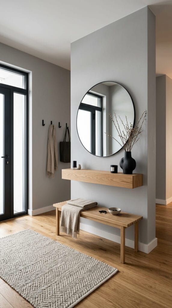
The secret lies in the fact that Monochromatic Modern is not just about a single color. It is a masterful interplay of shades, light and shadow, complex textures, and architectural forms. When color steps into the background, textures take center stage: wool, natural wood, tactile plaster, marble, matte metal, and glass.
The first impression of the style is established right at the threshold, where clean lines meet everyday functionality.
The Philosophy of Color and Light
At the core of the Monochromatic Modern style lies a deep understanding of tonality. Instead of cluttering the space with contrasting colors, designers use a single base color—most often soft gray, warm beige, graphite, or muted white—and unfold it across its entire spectrum: from the lightest, almost airy nuances to rich, deep accents.
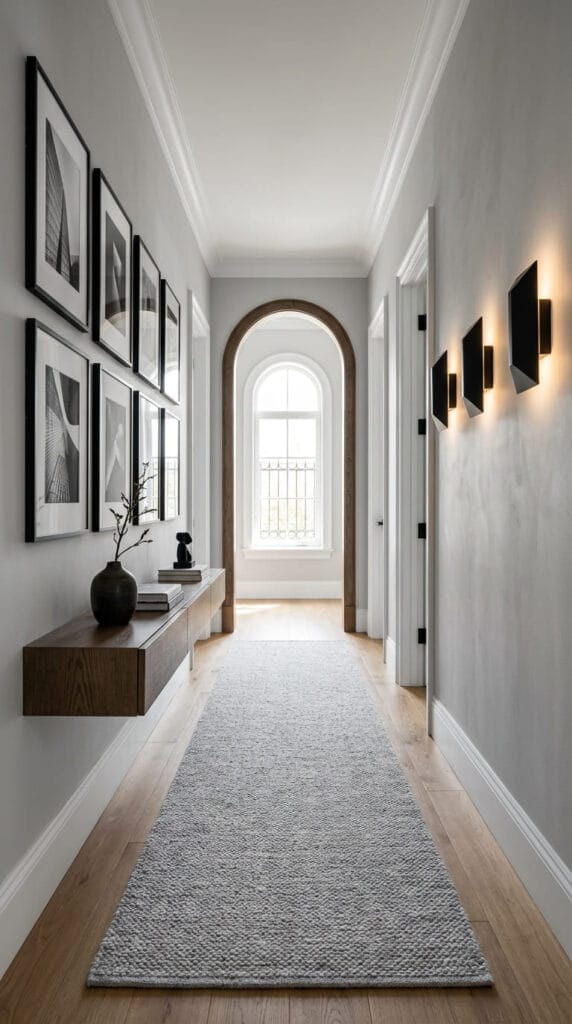
Thanks to this approach, room boundaries visually expand, and the interior begins to be perceived as a cohesive whole. Light plays a key role here: it glides over various surfaces, making matte, rough, and smooth textures look entirely different throughout the day.
Even long, narrow spaces like hallways transform into stylish architectural galleries when approached thoughtfully.
Textures as the Main Accent
When you step away from vibrant colors, tangibility becomes your main tool. An interior comes alive only when texture contrasts are introduced: porous concrete or textured plaster paired with a smooth coat of matte paint; a soft wool rug over refined oak parquet; warm timber set against sleek metallic accents.
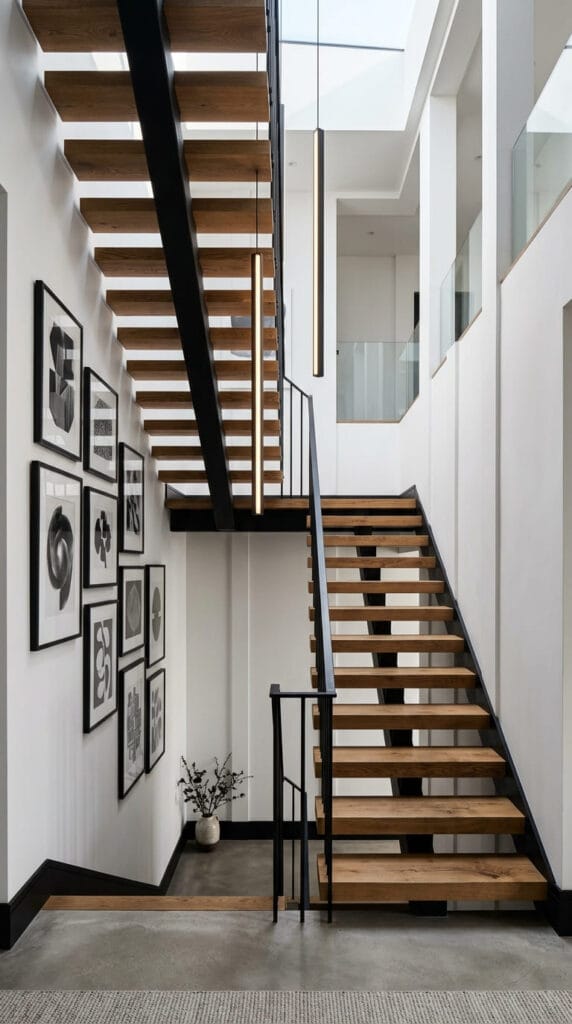
It is precisely this combination of opposites that saves monochromatic spaces from feeling monotonous. You don’t just look at the interior—you feel it with your hands.
The dynamic interplay of textures and vertical lines is especially prominent in transition zones like staircases.
Comfort and Tranquility in Private Spaces
Monochromatic Modern is perfectly suited for relaxation zones, as the absence of visual clutter helps the nervous system unwind after a busy day. A bedroom designed in this style becomes a true sanctuary of quiet.
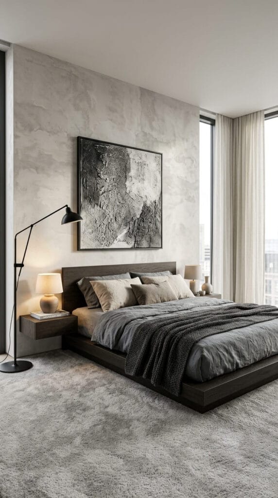
There are no distracting elements here—just a soft upholstered headboard, crisp linen or cotton bedding, soft diffused lighting, and expressive artwork that adds personality to the room.
The bedroom becomes the ultimate sanctuary for rest, where every decorative choice is thoughtfully curated.
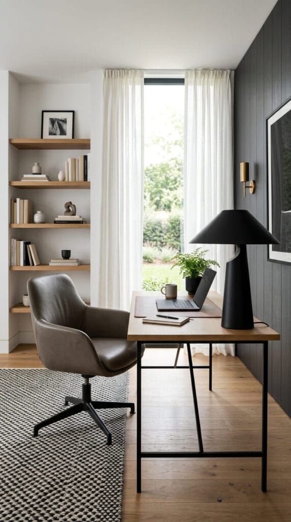
Working from home also demands maximum focus and freedom from chaos, making a monochromatic home office a logical and functional choice.
Children’s Room and Bathroom: Harmony Without Extra Noise
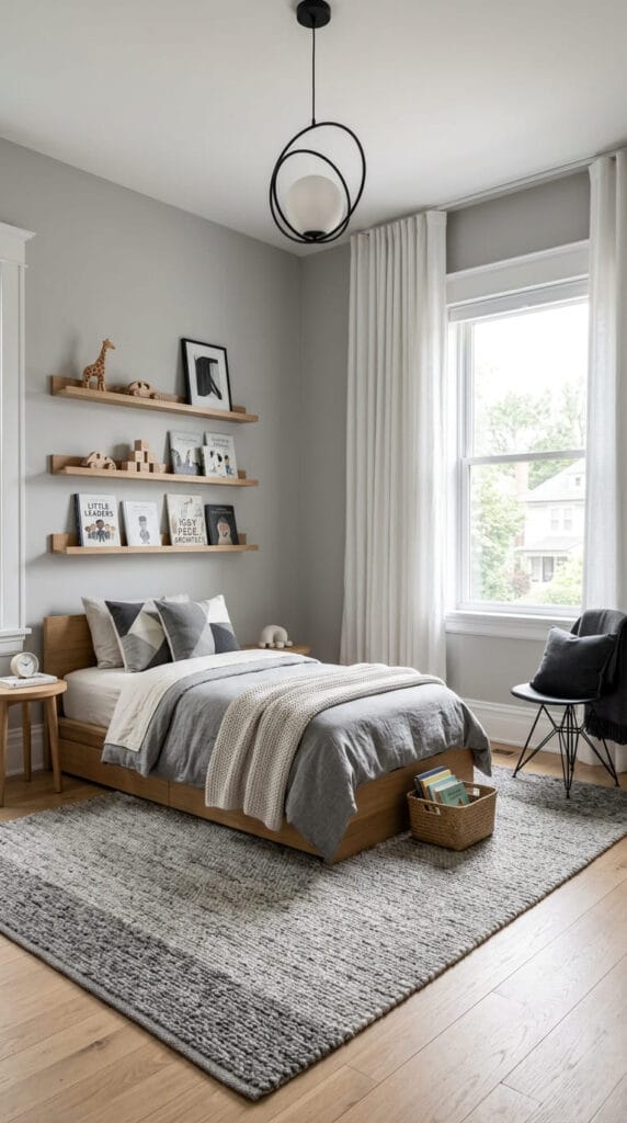
There is a common belief that Monochromatic Modern is only suitable for “adult” spaces, but that isn’t the case. In a child’s bedroom, a muted natural palette creates a serene environment that doesn’t overwhelm a child’s mind, gracefully accentuating natural toys, books, and children’s artwork.
The nursery turns out bright, functional, and aesthetic, while remaining incredibly cozy.
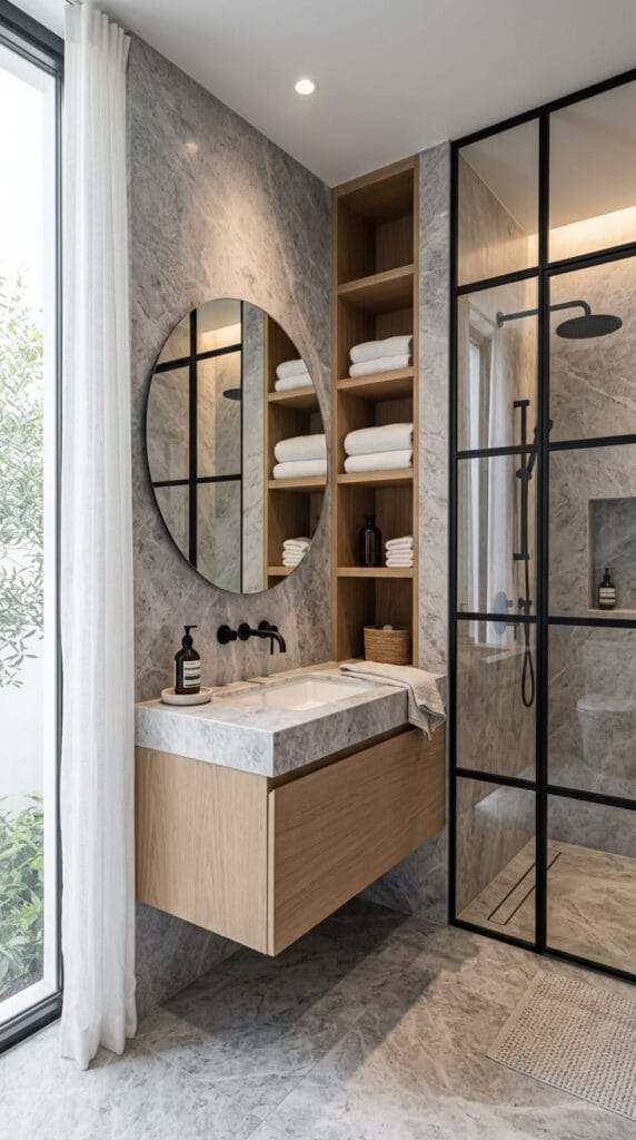
A bathroom in the Monochromatic Modern style resembles a high-end luxury spa. Using large-format stone-look porcelain tile, matte black fixtures, and natural wood creates a feeling of absolute purity and elegance.
3 Core Rules of Monochromatic Modern Style
To bring this style to life in your home and avoid a flat or cold atmosphere, follow these three simple principles:
- The 60-30-10 Rule in a Single Palette. Choose one key color. Apply its lightest tone to 60% of surfaces (walls, ceiling), a richer and deeper shade to 30% (furniture, large textiles), and the darkest or most contrasting tone to 10% (lighting fixtures, picture frames, hardware).
- Layering and Depth. Layer materials on top of one another. A plush or woven rug over a smooth floor, tactile wall plaster behind the headboard, chunky knit throws—it is the layers that build depth and warmth in a home.
- Architectural Black and Warm Wood. Black serves as a graphic outline in a monochromatic palette, pulling the space together (mirror frames, slender table legs, hardware). Meanwhile, natural wood elements offset the coolness of gray or white tones, infusing the home with natural warmth.
- Transitional Coastal: How to Combine Elegant Classics and Seaside Freshness Throughout the Whole House
- Sleek Scandi: How to Create a Light, Clean, and Cozy Scandinavian Interior Throughout the Whole House
- Equestrian Chic: How to Create an Atmosphere of Noble Estate Elegance and Aristocratic Comfort Throughout the House
- Cabin Chic: How to Create an Alpine Chalet Atmosphere and Secluded Comfort Throughout the Whole House
- Soft Industrial: How to Create an Aesthetic, Warm, and Modern Loft Throughout the Whole House
- Bright Boho: How to Create a Light, Cozy, and Vibrant Interior Throughout the Whole House